There has long been a debate on when photographers should shoot in black and white (bw) versus color. This is particularly true with respect to street photography, since many old shooters have held loud biases against shooting color. Before we debate the merits of their arguments, we need to understand a bit of history.
For decades, bw was the only real choice for photographers. Obviously, then, the developing history of the art was slanted toward masters whose entire portfolios were monochrome. When color photography began to emerge, these “serious” street photographers didn’t rush to embrace it. Color film was pricier, the development process was complicated and toxic, and color slide film was slow compared to bw film. Early users of color tended to relegate the film to places where its slow speed weren’t a problem: nature shots, posed photos where the models could hold positions, and urban shots that featured architecture and building details. In other words, black and white was for things that moved and color for things that didn’t.
Fast forward to the digital age, and you’ll find that the old photo dogs were not only still ranting about the superior seriousness of bw film, they were also explaining how true shooters used film, not pixels. Fortunately for photography, new users ignored their latter arguments even if young shooters, still looking at the wrong photography books, believed the former nonsense that color film produced inferior results. The truth is the same now as it was in the beginning–color photography is better in different situations that black and white. Real photographers can shoot with anything using any kind of camera.
So, when should one use color versus black and white? The real answer is you should use whichever produces the aesthetic you prefer. However, there are situations when bw is better suited and others where color will be the smarter choice. Let’s look at a few examples.
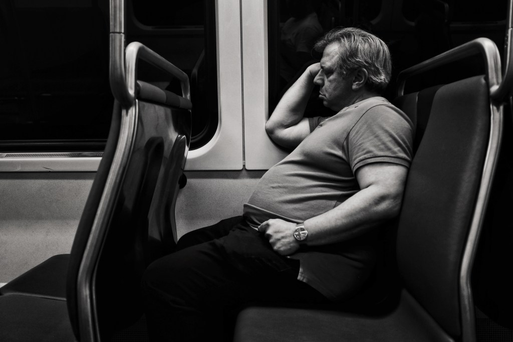

The color version of the sleeping man on the DC Metro (2019), above, his blue shirt is in harmony with the train’s seat and both complement the warm tones of his skin. The color becomes an important part of the composition, and since they compliment each other, color enhances the image. He’s positioned on the right, vertical phi line, so the line travels up to his face, where you still considering his visage.
In the black and white version, we lose the connection to his humanity because he’s no longer a warm hue. His skin is cool gray. He isn’t completely dehumanized, but we are a bit detached from him. Now we focus more on the structure of the train car, on the seat, the folds in his clothes, the shadows on his skin. I emphasized that structure and the detachment by increasing the contrast. Now his slumber isn’t as peaceful. Somehow, with his eyes hidden in shadow, his sleep is pitched with drama. I could have increased the contrast on the color image, but drama is easier to achieve when you remove non-essential color as an element.
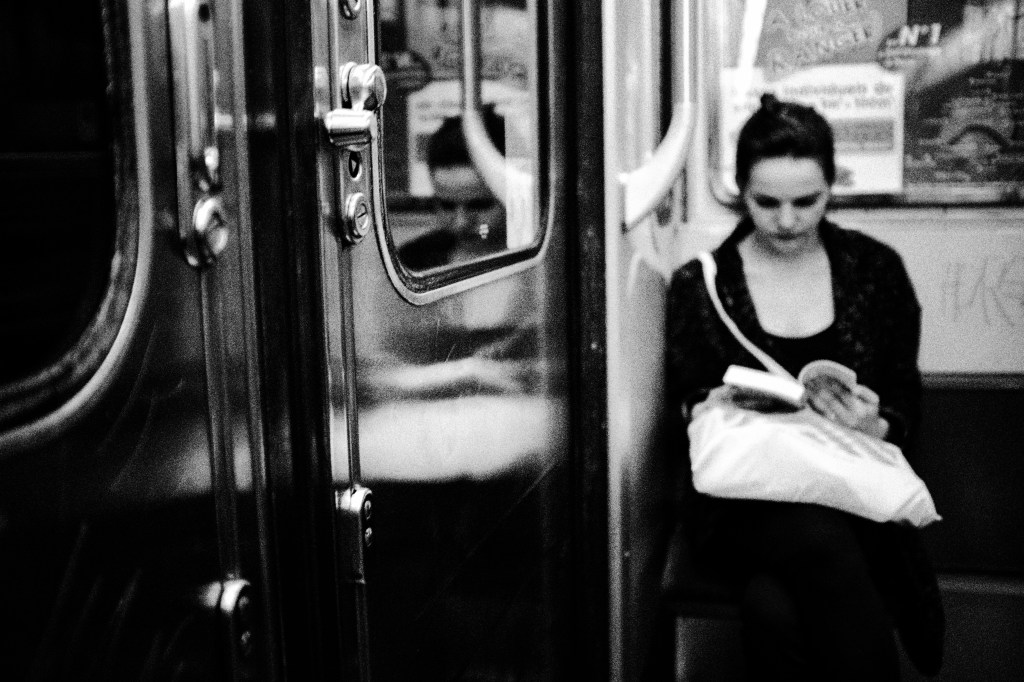
Like the DC Metro Shot, the above photo of the woman reading on the Paris Metro (2015) focuses on structure and story rather than the woman as a person. She is a reader, presented to the viewer as merely as a figure taking an action, rather than as a person with a story to present. We only know what she is doing and the arms-length feel of the bw keeps it that way. Instead, we focus on the metro car’s door and its gleaming metal. Structure is for black and white. Color for bringing that structure to life.
Now obviously, I’m oversimplifying by stating that black and white is for highly structured scenes or for creating an arms-length atmosphere between the subject and viewer. With skill, you can achieve anything via any medium. What I’m showing here is how to look at a scene and begin to think about whether it would best be presented with color or monochrome.

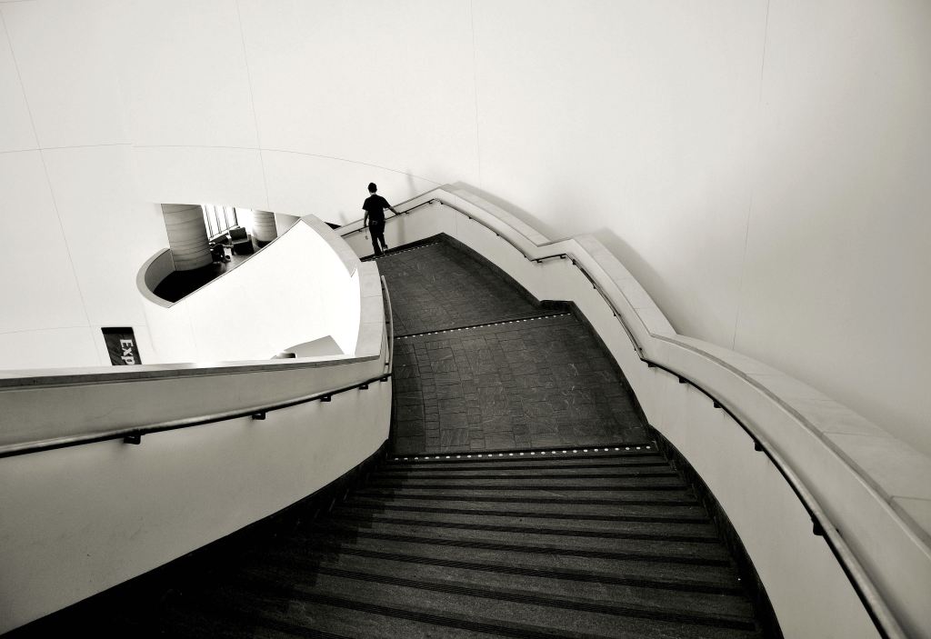
These two shots were taken on the main staircase at the National Museum of the American Indian in Washington, D.C. (2009). Both focus on the structure of the stairs, but in the color photo, the people stand out more and become a more important part of the composition. In the bw shot, even though there is a human, they have been reduced to a silhouette by the monochrome treatment.
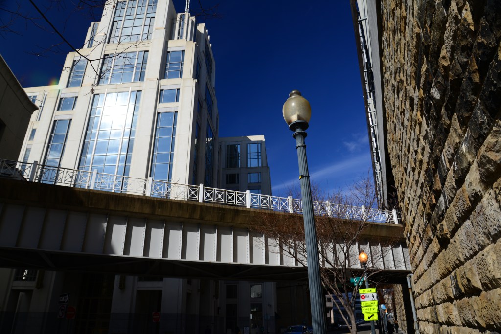
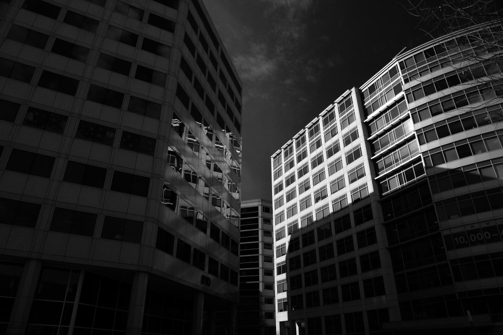
Again, two highly structural compositions of buildings near Union Station in D.C. (2013). In the color photo, I care about the blue sky and want to emphasize its reflections in the building window. The colors are harmonious and don’t attract your attention beyond where I want you to look. In the bw shot, I don’t care about the sky. This is photo about light, shadow, and rectangles. Full stop.
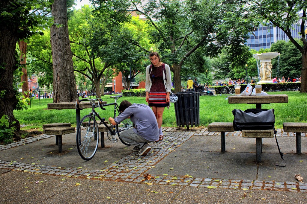
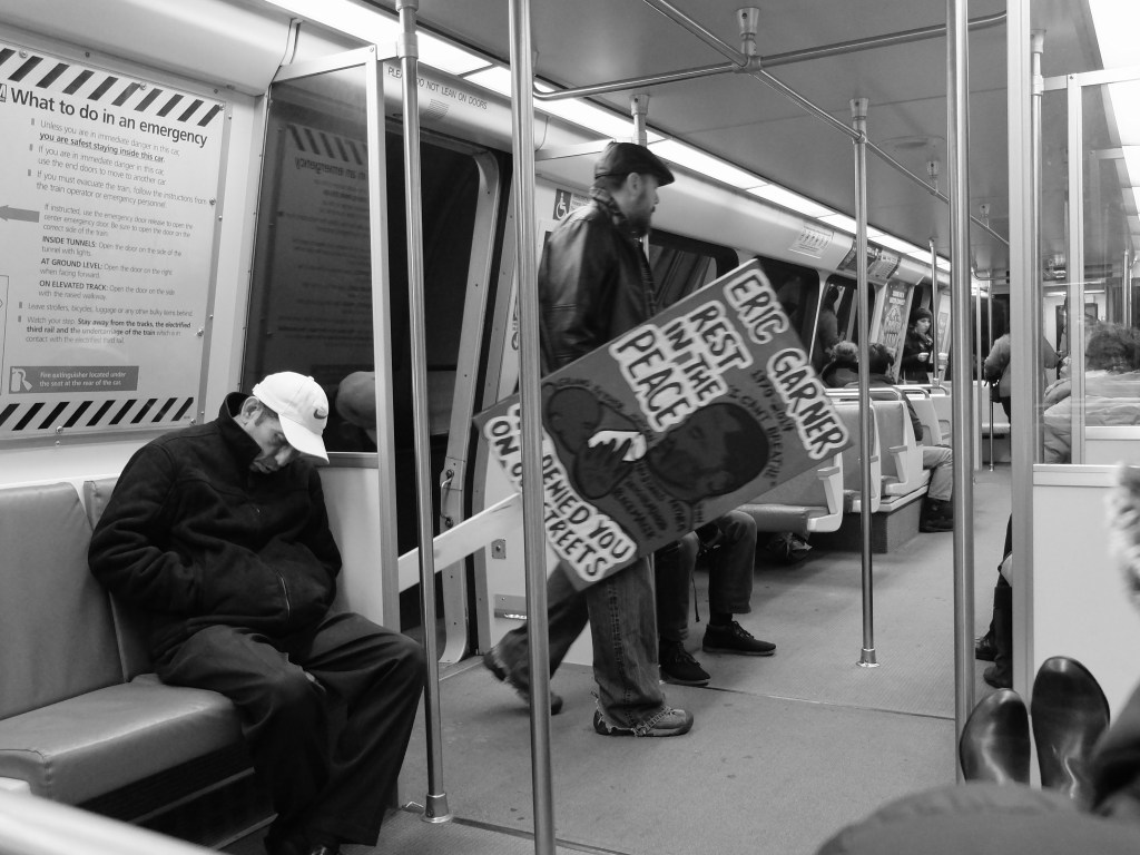
The final two photos show how color changes the story of humans in their environment. In the Bicycle Fix (2016) photo, we are drawn to the woman and her warm tones, standing like an island amongst the cooler ones. Her friend fixes her bike, but he’s cool too, so we don’t care about him. In the distance, the warm building at the left and the brightly hued people to the right promise there is warmth to be had when her friend finishes. In the other photo, again on the D.C. Metro (2013), a man enters the train with a sign protesting the killing of an unarmed man named Eric Garner. I was shooting in native black and white, so when he entered the train, the arms-length monochrome focuses your attention the sign and not its bearer. Humans are alive in black and white, but they aren’t our humans. They are strangers, others.
So, when do I decide that a photo should be in monochrome? I mostly shoot in color, since I use digital cameras. However, some cameras allow me to shoot natively in black and white, and a very few even let me see bw through the viewfinder. If you’re lucky enough to have one of those, you can see for yourself which photos work better in black and white. If you’re shooting with RAW, even bw shots come with a color RAW digital negative.
For newcomers, I recommend initially shooting in color and then looking at your photos once taken to determine which ones would structurally work better in monochrome. Focus on the linear and physical structure of the photos’ elements, yes, but also on the structure of light and shadow. BW works best with strong contrasts that produce blacks and whites rather than just a raft of grayscale.
And, as always, remember that the guidelines I provided above are just that. There are no rules. Art is not a prison; it is an escape.


